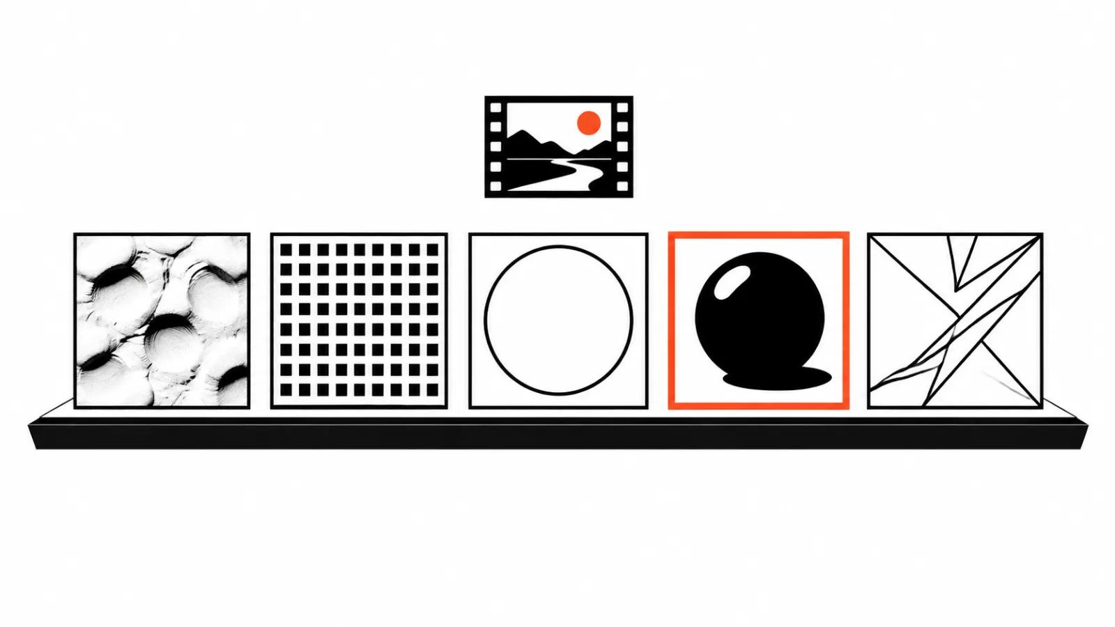
Why the style is settled before the first frame
Style is the first thing an audience sees and the last thing anyone argues about at sign-off. People debate the story, then redo the scenes because episode two came out looking like a different film.
The practical reason to decide early is simple. Generation does not hold a memory of your intent. Every new shot is assembled from scratch, and the style in the description is the only anchor keeping a scene close to itself.
So the real question is which visual language gives the most usable frames per iteration and the fewest visible seams on the timeline.
What the official guide says about style
In Google DeepMind's prompting guide for Veo, style is the first item. The instruction is to open the prompt by defining the kind of video you want: realistic, animated, stop-motion, or something else.
The same document has a separate block on defining style and tone, with a stop-motion example. The maker itself treats style as the frame that everything else, characters, action, sound, sits inside.
That matters in practice. When style goes unnamed at the start, the model infers it from whatever else is in the text, and an "animated" brief can come back photoreal while a "realistic" shot picks up cartoon proportions.
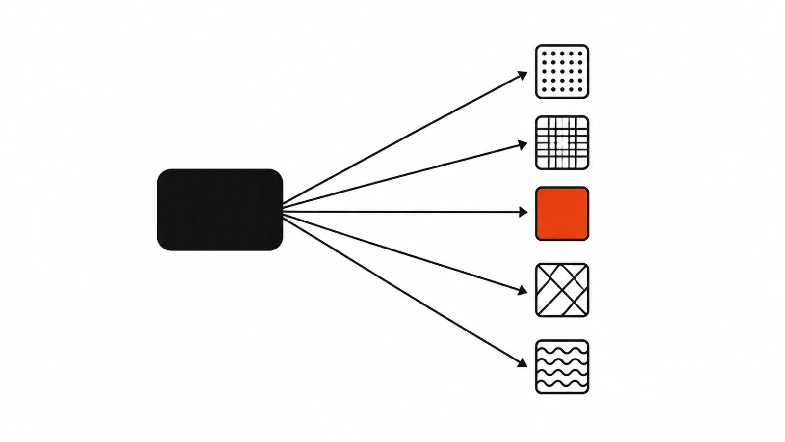
Five directions most projects choose
Classic 2D animation. Flat fills, clean outline, minimal texture. Characters read as silhouettes.
Anime. Large eyes, shorthand expressions, speed carried by motion lines. It works best for emotion and dialogue.
Clay and stop-motion. Material texture, visible hand of the maker, frames with a slight tremor.
Pixel art. Low resolution treated as a feature, a limited palette, movement built on a grid.
3D render. Volume, materials, light. Closest to advertising imagery and furthest from anything drawn.
What each style forgives
A style is also a tolerance for error. One hides artifacts, another puts them under a spotlight.
Clay forgives sloppy geometry, since texture and unevenness belong to the language. It forgives almost nothing in consistency. Five fingers in one shot and four in the next will be spotted faster here than anywhere else, because the audience compares the result to real modeling.
Pixel art forgives nearly everything inside a pixel: soft edges, odd joints, noise. The price is restricted motion. A smooth camera sweep feels foreign in that aesthetic.
Anime forgives imperfect lip sync, because the mouth is drawn as shorthand. It is merciless about faces. If the eye shape or the chin shifts between shots, the character stops being the same person.
Classic 2D forgives simplified detail and demands a steady line. A wobbling outline reads as a defect here and as style in clay.
3D forgives a lot of composition and almost nothing about light. Light arriving from different directions in adjacent shots exposes a patchwork assembly right away.
Where each one breaks
Hands stay the weak point everywhere except pixel art. The model loses count and placement when a hand fills the frame.
Fast motion breaks anything that depends on material. Clay and 3D smear into jelly, 2D snaps the line.
Scene changes. Style holds while the location holds. Swap the set and the palette or the outline weight often drifts, and the edit has to rescue it with color grading.
Text inside the frame. Lettering in any drawn style comes back misspelled or garbled, so titles and prices belong in post.
Mixed styles in one film. A 3D character against a watercolor background reads as two projects stapled together unless someone blends them on purpose.
What style costs at the revision stage
A revision in a drawn style is usually cheaper than in 3D. The whole scene can be regenerated, because detail is low and the eye has nothing to lock onto.
In 3D the cost sits in consistency. Every new scene has to match the same light and the same material, or the entire sequence gets rebuilt.
The practical takeaway: for a single-pass film with simple staging, choose a low-detail style. When a product has to appear on screen with highlights and surface, 3D delivers the image and charges you in matching time.
How to lock the style in a brief
Four things worth writing down before the first generation.
First, the name of the direction plus one reference. Be specific: "clay, large thumbprints, soft light". A vague mood note will not hold across shots.
Second, a palette. Three colors and a rule about what not to do with them.
Third, character proportions. Head, hands, height. These are the first things a model drifts on.
Fourth, a definition of a reject. Photoreal skin in a drawn film, a hard shadow in a clay scene.
From there the style travels into every prompt in identical wording. Action and camera change, the visual language stays verbatim.
What to choose for the job
If a series has to hold one look, it helps to read the guide on how to make a cartoon with AI: the breakdown shows where style leaks between shots. Campaigns that need a hand on every movement are better served by handcrafted videos, where the decision sits with a person. When the volume is high and the stories differ, AI video production sets the look once for a whole run. It is also worth reading how commissioning animation compares across technique, because the production method shapes the style more than most briefs admit.
| Job | Style | Watch out for |
|---|---|---|
| Dialogue and emotion | anime | faces drifting between shots |
| Product on screen | 3D render | matching the light across scenes |
| High-volume series | pixel art | restricted camera movement |
| Warm human story | clay | keeping details consistent |
| Dense on-screen text | classic 2D | titles belong in post |